
How Data Visualization Improves Order Tracking Accuracy
Data visualization transforms order tracking into a faster, clearer, and more reliable process. By turning raw data into actionable visuals like dashboards, heat maps, and charts, businesses can reduce errors, identify bottlenecks, and improve delivery accuracy. Here’s how it works:
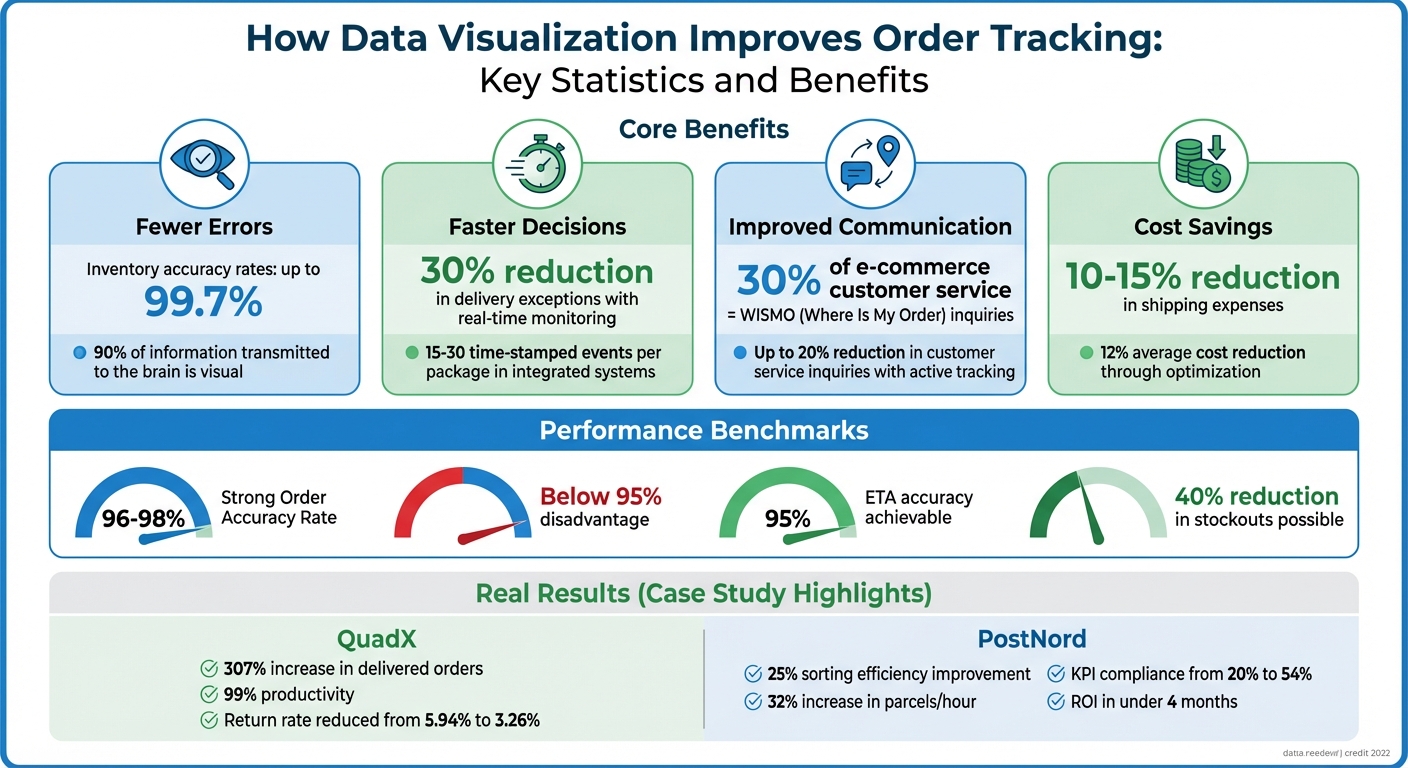
- Fewer Errors: Visual tools simplify spotting mistakes, boosting inventory accuracy to rates as high as 99.7%.
- Faster Decisions: Real-time visuals pinpoint delays, helping teams address issues like staffing or carrier problems immediately.
- Improved Communication: Shared dashboards ensure all teams have access to the same, up-to-date information, cutting customer service inquiries by up to 20%.
- Cost Savings: Tools like Navexa optimize shipping costs, reducing expenses by 10–15%.
These tools have helped companies like QuadX and PostNord streamline operations, reduce delays, and achieve measurable improvements in efficiency and accuracy.
How Data Visualization Improves Order Tracking: Key Statistics and Benefits
Benefits of Visual Data Tools for Order Tracking
Better Accuracy and Fewer Mistakes
Visual tools make it easier for teams to catch errors that might otherwise go unnoticed. Since the brain processes visual data much faster than text - and with 90% of the information transmitted to the brain being visual - warehouse managers can quickly identify problems without sifting through endless spreadsheets.
Take the example of OrderMonitor, a visual analytics system introduced in January 2022 specifically for e-commerce warehouses. Using a "sedimentation metaphor" and combining Gantt charts with Marey's graphs, it provides real-time order tracking and highlights bottlenecks in the process. Managers can then prioritize tasks to improve efficiency, all based on actual warehouse data. These visual techniques make it easier to detect patterns and anomalies that would be buried in raw numbers.
Connor Perkins of G10 Fulfillment underscores the value of scan-based accuracy:
"You can lose a lot of money in this industry by having people ship stuff wrong, or store it wrong... having a 3PL and WMS that is 100% scan-based is crucial".
Scan-based systems track every step - picking, packing, and shipping - minimizing the chances of sending incorrect items or quantities. Through such data-driven workflows, high-performing operations can achieve inventory accuracy rates of up to 99.7%. This level of precision enables quicker and more confident decision-making.
Faster Decisions with Real-Time Data
Real-time visuals transform raw data into actionable workflows. Bryan Wright from G10 Fulfillment explains:
"A tracking workflow becomes reliable when it is tied to these real events... It shows the product landed on the dock at 8 o'clock. At 8:10, John picked it up... and at 11:00, we packed it".
This level of detail allows managers to pinpoint exactly where an order is delayed - whether at the dock, during picking, or in packing - eliminating guesswork.
These visuals also help teams distinguish between warehouse-related delays and carrier issues, allowing for more targeted solutions. For example, real-time logistics monitoring paired with dynamic carrier selection can reduce delivery exceptions by 30%. With immediate insights, teams can reroute shipments, adjust staffing, or contact carriers before minor delays escalate into major problems. This real-time clarity supports smoother and more reliable order tracking.
Better Team Communication
Visual data fosters better communication by providing a shared, transparent view of order statuses. Maureen Milligan from G10 Fulfillment highlights this benefit:
"What these real-time portals provide our customers is 100% visibility... they can see their daily orders, they can see KPIs, and they can see historical transactions".
When everyone - from warehouse staff to customer service teams to customers - has access to the same information, confusion about order statuses is eliminated. A single package in a well-integrated logistics system can generate 15 to 30 time-stamped events. Visual dashboards consolidate all this data, creating a unified view across multiple carriers.
This unified system can significantly reduce "Where Is My Order" (WISMO) inquiries, which often make up as much as 30% of e-commerce customer service contacts. By implementing active tracking notifications, businesses can cut these inquiries by up to 20%. This streamlined communication lays the groundwork for the advanced visual monitoring systems discussed next.
sbb-itb-ed0a9d1
Delivery Tracking Dashboard | Microsoft Power BI
Visual Data Methods for Order Tracking
Visual data methods take raw tracking numbers and turn them into clear, actionable insights that help streamline every step of order processing.
Dashboards for Live Monitoring
Dashboards provide a real-time snapshot of fulfillment metrics like pick rates, packing times, and shipping cutoffs by pulling live data from systems like WMS, ERPs, and carrier APIs. This eliminates the risk of manual errors and keeps everyone on the same page. The best dashboards are role-specific, offering tailored views for different team members. For instance, operations leads might focus on metrics like pick rates and warehouse throughput, while customer support teams keep an eye on fulfillment delays and carrier performance. By integrating multiple real-time data sources into one place, these dashboards help prevent issues like overselling or stockouts. Monitoring metrics such as "Perfect Order Rates" and shipping statuses in real time allows teams to address problems as they arise and notify customers proactively, reducing complaints. Beyond dashboards, other visual tools offer further clarity into order tracking challenges.
Heat Maps for Spotting Patterns and Problems
Heat maps, often displayed as regional visualizations, highlight order accuracy and delivery times across different geographic locations. These maps make it easy to spot problem areas at a glance. For example, a particular region might consistently face delays or have carrier issues. Instead of combing through endless rows of data, managers can quickly identify these trouble spots with color-coded visuals. This insight allows for targeted actions, like switching to a more reliable regional carrier, repositioning inventory, or adding extra quality checks in high-risk zones. Heat maps turn raw data into a straightforward visual story, clearly showing where improvements are needed. To dig even deeper, teams can pair these maps with historical data charts.
Charts for Past Performance Analysis
Charts, like line graphs and bar charts, make it easier to analyze historical data and predict future trends. Line graphs can track shipping times or inventory turnover over weeks or months, helping businesses adjust stock levels before problems arise. Bar charts, on the other hand, are great for comparing accuracy rates across different warehouses or teams, pinpointing areas - like picking or packing - that might need additional training or process tweaks. An Order Accuracy Rate between 96% and 98% is considered strong, while rates below 95% can hurt a company’s competitive edge. These visual tools turn past performance data into clear insights that help improve future order tracking and accuracy.
Case Studies: How Visualization Improved Tracking Accuracy
These examples highlight how tools like dashboards and heat maps can transform order tracking, addressing fulfillment challenges and delivering measurable results.
Case Study 1: Cutting Delivery Delays with Visual Dashboards
In April 2025, QuadX, a logistics startup based in the Philippines, faced the challenge of scaling its operations without compromising delivery accuracy. Under the leadership of Founder Dino Araneta, the company adopted FarEye's delivery management platform to gain real-time visibility into last-mile operations. By integrating this platform with its sorting systems, QuadX automated the order-to-door process and introduced dynamic routing that accounted for variables like traffic and weather conditions.
The results were impressive: QuadX saw a 307% increase in delivered orders, totaling over 22.1 million. The company also hit 99% productivity in both delivery and pick-up operations and reduced its return rate from 5.94% to 3.26%. Araneta praised the platform, stating:
"FarEye's platform enabled QuadX to interpret market conditions instantly and route orders for on-time, accurate deliveries."
While dashboards excel at refining delivery logistics, heat maps provide a different but equally impactful perspective on operational bottlenecks.
Case Study 2: Finding and Fixing Errors with Heat Maps
Between May 2023 and January 2024, the PostNord Hakkila terminal in Finland turned to visual analytics to tackle recurring bottlenecks in its sorting operations. Project leaders Christian Østergaard and Ravi Kiran Kotty implemented Quuppa's real-time location system (RTLS) alongside computer vision. They also introduced a "traffic light" tool, using green, yellow, and red indicators to help staff quickly identify and prioritize problem areas.
This approach paid off. Sorting efficiency improved by 25%, parcels handled per hour increased by 32%, and KPI compliance jumped from 20% to 54%. Remarkably, the terminal achieved a return on investment in less than four months. Østergaard highlighted the impact of visualization, noting:
"This visualization enables them [staff] to make better use of themselves without the need for management to intervene."
These cases lay the groundwork for understanding how platforms like Navexa utilize visual analytics to enhance order tracking comprehensively.
Using Navexa for Advanced Data Visualization
Navexa takes data visualization to the next level, improving order tracking accuracy by offering unified, real-time insights. This platform integrates multiple visualization tools and supports more than 2,500 brands, processing over 50 million packages annually.
Real-Time Analytics for Multi-Carrier Tracking
Navexa's dashboard consolidates live tracking updates from USPS, UPS, FedEx, and DHL into a single interface. Businesses can analyze carrier performance, comparing delivery times and reliability, while smart alerts notify users of potential shipping delays. Marcus Rodriguez, VP of Logistics at Urban Outfitters, oversees more than 10,000 orders daily using Navexa. He shares:
"We ship 10,000+ orders daily and Navexa handles it flawlessly. The multi-carrier rate shopping is a game-changer."
This real-time data not only enhances operational agility but also helps control costs. The package cost dashboard tracks spending patterns, flagging high-cost shipments instantly. Users have reported an average 12% cost reduction by leveraging these insights. Historical savings charts further demonstrate how optimization decisions impact long-term expenses.
Better Performance Through Platform Integrations
Navexa syncs data from over 50 platforms, including Shopify, WooCommerce, and Amazon, eliminating the need for manual data entry. Its one-click setup ensures dashboards are always up-to-date, with an impressive 99.9% uptime reliability.
Emily Watson, Founder & CEO of Glow Recipe, used Navexa to address inventory challenges by connecting all her sales channels to the platform's real-time inventory monitoring. This move cut stockouts by 40%. She explains:
"The inventory forecasting feature helped us reduce stockouts by 40%. Our customers are happier than ever."
The platform also visualizes stock consumption trends, enabling businesses to adjust reorder points proactively. These seamless integrations help reduce costs and improve order accuracy.
Lower Costs and Better Efficiency
Navexa's 3D bin packing algorithms optimize box sizes for shipments, lowering dimensional weight charges. In 2026, Sarah Chen of Bloom & Wild saw a 12% reduction in shipping costs within just one month, with savings from box optimization covering the platform's cost.
Automated workflows process orders three times faster than manual methods. Alerts for missing dimensions ensure product data is complete, preventing delays and incorrect shipping rates. Combined with multi-carrier rate shopping, which delivers average savings of 10–15%, Navexa provides a comprehensive toolset for precise tracking and cost management.
Conclusion
Data visualization transforms order tracking from guesswork into precision. Tools like real-time dashboards, heat maps, and predictive analytics help reduce manual errors and cut customer service inquiries by 20% to 30%. These solutions give businesses the ability to spot potential problems early, choose carriers more effectively, and keep inventory levels accurate.
Companies using visual analytics report impressive results, including 95% ETA accuracy and delivery cost reductions of up to 15%. For example, when UPS adopted route optimization driven by visual data, the company saved millions of dollars annually. Similarly, integrated inventory forecasting can lower stockouts by as much as 40%.
Navexa builds on these advantages by offering a platform that combines multi-carrier tracking, inventory management, and cost analytics into unified dashboards. With automated workflows, Navexa processes orders three times faster than manual methods, while maintaining accuracy through features like address validation and dimension checks.
Brands using Navexa's tools report 10–15% savings on shipping costs and 40% fewer stockouts, all while managing thousands of orders daily. Customers also benefit from more accurate delivery updates and fewer delays, fostering trust that encourages repeat purchases.
FAQs
What order-tracking data should I visualize first?
Visualize a system that provides real-time status updates, tracks shipment milestones, and monitors delivery success rates. These updates not only keep customers informed but also help lower the volume of support inquiries. By tracking shipment milestones - such as order confirmation, shipping progress, and final delivery - you can easily pinpoint progress or identify potential delays. Keeping an eye on delivery success rates, along with reasons for any failures, helps uncover bottlenecks and enables quick fixes. Paying attention to these metrics boosts transparency, enhances customer satisfaction, and streamlines operations.
How do I connect WMS, carrier, and store data into one dashboard?
To bring together WMS, carrier, and store data in a single dashboard, you'll need a unified platform capable of integrating these systems seamlessly. This typically involves using APIs or direct integrations to merge data from orders, inventory, and transportation. The result? A consolidated dashboard that offers real-time visibility into your supply chain, making it easier to streamline operations and make informed decisions.
Which KPIs best measure order-tracking accuracy and delays?
Key performance indicators (KPIs) to evaluate order-tracking accuracy and delays include:
- Delivery success rate: Measures how often orders are successfully delivered to the right destination.
- On-time delivery rate: Tracks the percentage of orders delivered within the promised timeframe.
- Tracking update frequency: Monitors how often tracking information is updated to keep customers informed.
These metrics help gauge the reliability and timeliness of your order tracking system, highlighting areas that may need attention to improve efficiency and customer satisfaction.
Ship your next order through Navexa.
Connect a store, buy a label, and see the numbers yourself.